


Tutorial from AEO
The basics of SKP are available here or directly in SKP.
Download Google sketchup for free here.
For google sketchup (free version), it's not too hard to setup the screen for simutrans.
Simply load this template file I made in sketchup and play around with it.
It's easy replicate so you can make your own file and start from scratch.
I haven't found any better way to do it currently, but to render different rotations, select your entire screen with drag select, right click and select “create group”, copy it, paste it and then rotate it with the rotate tool. It's best to have a 'base tile' at the floor for each of your objects so that it is easier to scale your renders.
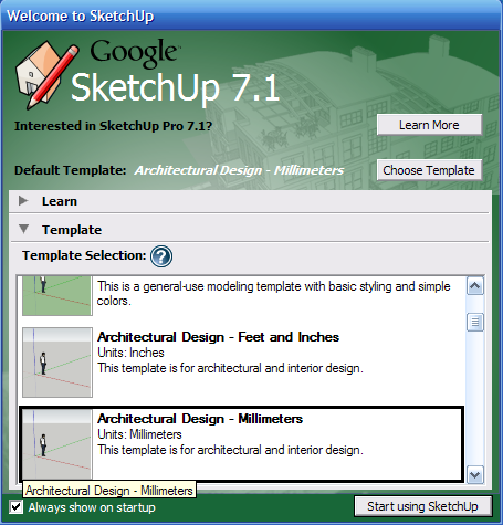
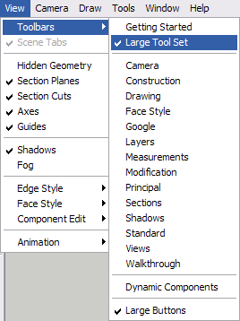
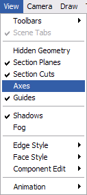
For first time users, you should change some settings, as shown.
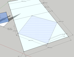
To recreate the 'camera aligning prism'


For now, Let's just try and create something 3D in sketchup. It doesn't matter what it is, but simply play around with it. In this example, I've made a very simple house, but once you get used to sketchup, you should easily be able to create much more complex objects.
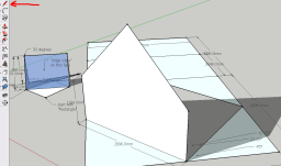
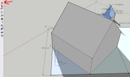
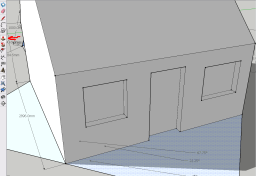


To render an object in simutrans style graphics change the following settings.
1: Menu: Camera → Parallel Projection
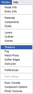
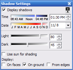
Shadow settings
- Display shadows: On
- Time: 13:30
- Date: 11/8
- Light: 80 (personal preference)
- Dark: 45 (personal preference)
- Use sun for shading: (optional)
- On faces: off
- On ground: on
- From edges: off
3: Menu: View → Display edges: off, Display profiles: off (on for comic)
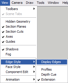
4: Menu: View → Face style: Shaded with textures
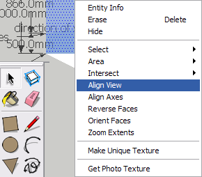
6: Toolbar → Pointer Arrow → Right click on blue face of triangular prism to the left with “Align View” and Select “Align view”.
7: Toolbar → Hand icon → Pan camera to fit your creation on screen.

8: Toolbar → Zoom (magnifying glass icon) or use your mouse wheel to zoom in and out.

A proper zoom level for rendering can be a bit difficult to reproduce if you're using the free version, so this is a bit of trial and error, but you want to work with a render size that's at least 2x larger, or 4x, than the pak tile size you are working with. For pak128 you want that blue square to be somewhere between 253 and 258 pixels large when you render it.
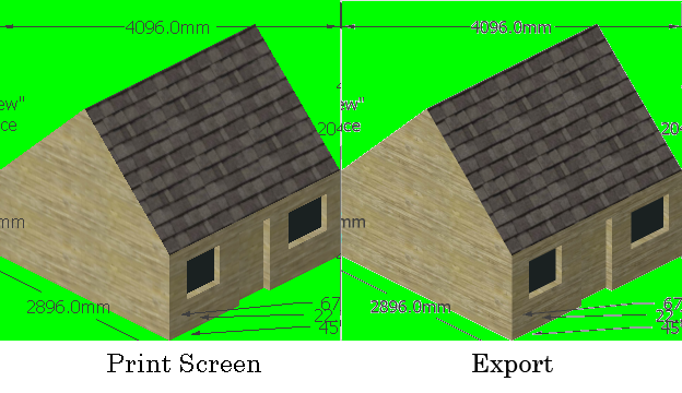
To render, there are two options. One is simply the “Print screen” key, which will give you a render that has no smoothing (Anti-Aliasing) done to it. The other option is to go to Menu → File → Export → 2D Graphic → <insert name>.png. The export method will give AA, but since the image will be shrunk and given AA anyways, it's quicker to just paste your screen captures into an image editing program directly.

Now that the files are rendered, you should open them up in your favourite picture editing program so you can piece together your images properly.
First you should cut away the tile you want and make sure it is a square. The square in the background should be a perfect square, or pretty close to it. It's not too important if the background square is off by 1 or 2 pixels since you will be deleting it, all that matters is that your image is properly aligned inside the square. It's best if you first cut away the background from your main image and it's easier to separate the background from your object if there is no smoothing done to the edges. That's why I recommend using the screen shot instead of exporting. If your image editing program supports transparencies, use that so that there are no coloured background pixels on your main image. If your program doesn't have that, fill the background in with a high contrast colour, like magenta or lime green or cyan that's easy to distinguish.
Comparison of screen capture vs. exported render:
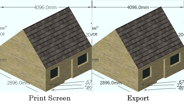
So now you have a square cut away and the next step is to resize it to fit your pak tile size. Once you separate your image from the background, resize it. This is where it becomes important that you rendered your image in 2x or 4x size. The resizing function gives better results when resizing images if it's a simple number, like 50% or 25% of original size instead of 28.5%, 66.67% etc.
Once you have resized the image, you should clean up the edges, as this is unavoidable when using a resize that has AA. After cleaning up the edges, fill in the background with simutrans transparent blue, R231, G255, B255 (E7FFFF).
Advanced tips
Tip 1: Render as many rotations and objects that fit on your screen at once. Much faster to do all the above steps when you have tools like magic wand and batch resize.
Tip 2: You can actually do both print screen and render through export and mix them together. Use the edges of the print screen and the core of the export.
Tip 3: You can do the same when resizing. Do a resize with 'nearest' and also a resize with 'bicubic'. Use the magic wand tool to select the background of the 'nearest' resize layer, then select the bicubic resize layer, hit delete, then merge the two layers. You'll now have crisp edges and a smooth core.
Tip 4: You don't have to use simutrans transparent blue during the render, as done in the template. Render with whatever colour gives high contrast.
next tutorial : Chapter III: source files.